G33K0UT - A Hackathon Case Study
On November 21-22, 2019, our team had the pleasure and thrill to take part in General Assembly Seattle’s Hackathon. Our team created G33K0UT, a mobile app that allows geeks to find a community where they belong. I am proud to say that our product won Best Implementation.
Role: UX Designer
When: November 2019
Duration: 30 hours
G33K0UT Team
me - UX Designer
Christina Woon - UX Designer
Kyle Van Bergen - Developer
Sean Ross - Developer

Research
Our team started the project with a focus of creating a meetup app for geeks. Our team’s UX Designers, Christina and I started by conducting user surveys and interviews. To understand our user’s goals and pain points, we asked questions about their past experiences looking for and attending meetups.
13 Online Surveys
5 User Interviews
Here are 3 key insights from our user research:
Users are looking for a community where they can feel belong
Users attend meetups because they want to learn something new
Users are concerned about being around a big group of strangers
To make sure that we are designing for G33K0UT’s user, I created a proto-persona, Seth Doyle. I am going to reference Seth to help represent our user throughout this project.
Synthesizing Research
We know that Seth has just moved to Seattle and are looking to find a community of LARPers (Live Action Role Players). He is uncomfortable being around and sharing his information in a big group of strangers. What can we do to help Seth?
We believe that by designing a mobile app that allows geeks to find meetups, we will allow them to find a community where they can connect with people who share similar interests and learn something new.
To define out MVP (Minimum Viable Product), I created a task flow that will allow Seth to easily find new LARP communities.
Sketching
Prior to sketching screens, Christina conducted comparative analysis to learn what works well and what could be implemented from G33K0UT’s competitors sites. Then, she began sketching out low-fidelity wireframes following the user flow that I created.
To make sure that the features in the sketches are feasible to build in a day, we shared the sketches with our developers.
(sketches below by Christina Woon)


Low-Mid Fidelity Prototypes
After getting insights from the developers, we designed a mid-fidelity prototype using Figma. To conduct usability tests, I created a user scenario and tasks. The user scenario is specifically written to put the usability test participants in our persona’s shoes. The goal of conducting usability tests is to collect user insights and SUS (System Usability Scale) scores. SUS scores measure usability and ease-of-use of the app.
Scenario:
Seth is a LARP enthusiast who just moved to Seattle 3 months ago for College. He is interested in finding a new LARP community to meet new people in Seattle while also learning new skills to make him a better LARPer.
Tasks:
Sign up
Go through on-boarding/personalization
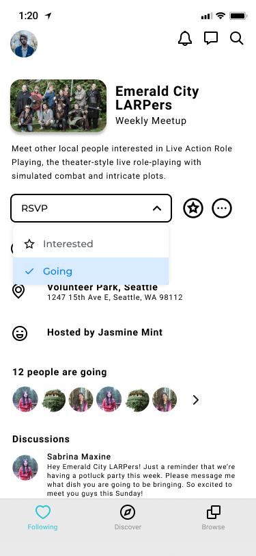
Go to event Emerald City LARPer page
Get time and location of meetup
RSVP


Usability Testing Round 1
SUS Score: 90.8
Participant: 3 geeks
Insights and feedback from Round 1:
Participants were not sure where to click after selecting interest
The calendar icon in the login page makes it feel like a scheduling app. One participant was wondering if it sync or integrate with her google calendar


Usability Testing Round 2
SUS Score: 91.3
Participant: 2 geeks
Insights and feedback from Round 2:
Participants were able to find event information and RSVP
Participants expressed confusion in the on-boarding process because the color of the button is not the brand colors. Therefore they thought that it was a button from the device instead of the app.


Usability Testing Round 3*
SUS Score: 99.1
Participant: 3 geeks
Insights and feedback from Round 3:
All participants successfully completed the tasks
One participant wondered if the map shows her current location or the meetup’s location
Participants expressed that the prototype is easy to use and looks beautifully designed
*For our 3rd iterations, we transitioned to using high-fidelity prototype because we wanted to test the use of brand colors to address a piece of feedback from the 2nd round of usability testing
High Fidelity Prototype
Prior to designing high fidelity prototype, Christina and I created a style guide consisting colors and typefaces that will be used throughout the app.
In the high fidelity prototype we used the typeface Roboto in the styles of Regular, Medium, and Bold.
Next Steps
Design and test a feature to rate user profiles and meetups
Add “intent” page in the on-boarding process so that users can meet people with similar interests and commitment levels (i.e. someone who likes to play Dungeons & Dragons 3 hours a day vs. someone who only plays once a week)
Add warning signs in the meetup page if someone you’ve reported is attending the meetup
What I learned:
This project provided me with my first experience working with developers. It was very interesting to include developers throughout our brainstorming and designing process. I learned that a feature that might look simple for could actually be very complicated to build. Thus, a good communication line is extremely important between Designers and Developers.
Even with such a short timeline, I made sure that I got as much feedback and insights as possible. Our team used the Lean UX technique to focus on obtaining feedback early to make quick decisions. To create rapid prototypes and iterations, I collaborated with another UX Designer in the group where we learned to use Figma for the first time.
G33K0UT Team
(left to right)
Kyle Van Bergen - Developer
me - UX Designer
Christina Woon - UX Designer
Sean Ross - Developer


