Biscuit Bitch Website Redesign
Biscuit Bitch is a local business that aims to serve delicious authentic food while also building real relationships with locals as well as tourists.
Just like other businesses that are located in the heart of Seattle, one of the problems that Biscuit Bitch's customers face when visiting the business is long wait time and not enough space.
How can a website redesign better serve Biscuit Bitch’s users?
Role: UX Designer
When: September 2019
Duration: 10 days

Research
Coming into the project, I was provided with a proto-persona, Lauren.
I analyzed the current Biscuit Bitch website to find Lauren’s needs that are currently not met:
Able to submit product reviews
Efficient checkout process
Multiple/large product photos
Small Product Details
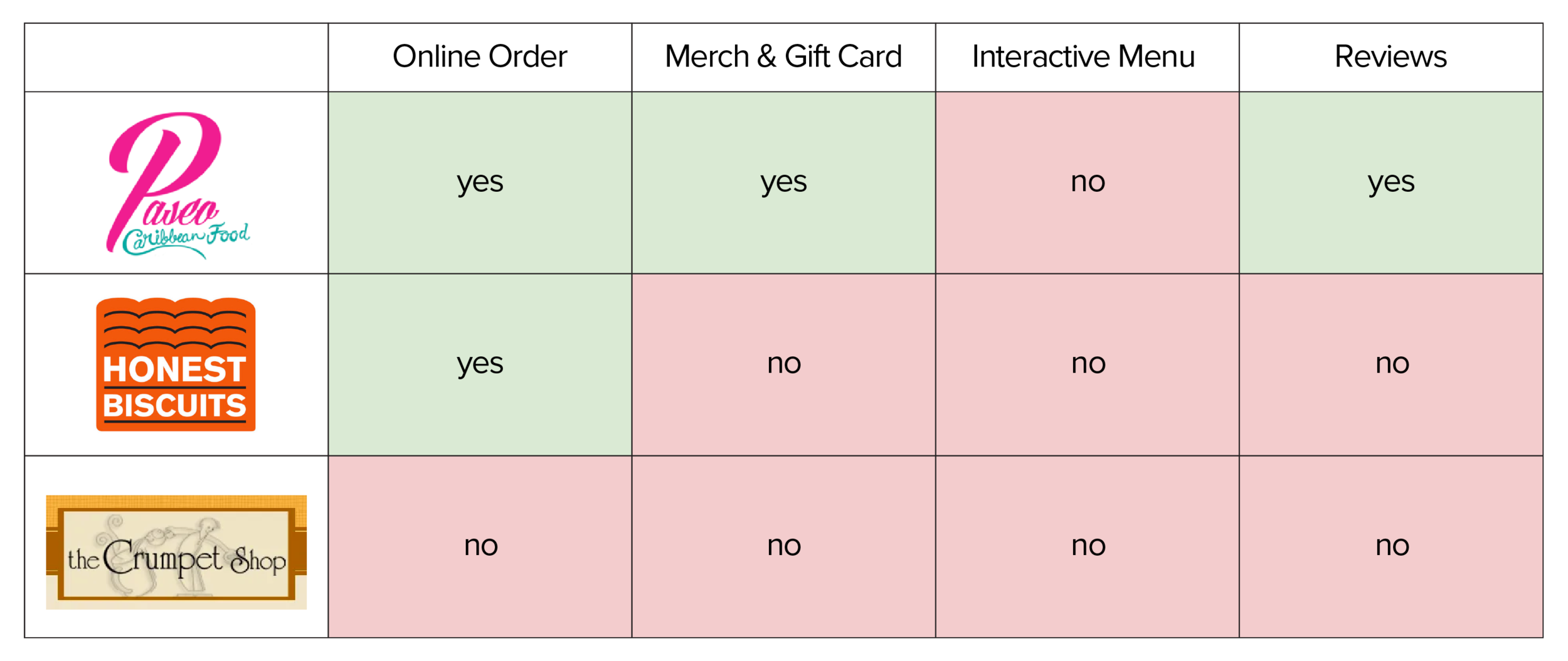
Based on the list of Lauren's unfulfilled needs, I came up with 4 possible features and did a comparative analysis to see how Biscuit Bitch compares to its competitors.
Synthesizing Research
Since I am working with a business, it is important to keep in mind that the ultimate goal of the website redesign is to increase conversion rate and ultimately make the business more profitable. With that business goal as well as Lauren’s needs in mind, I came up with a hypothesis:
“By providing a website that allows users to order ahead, leave a review, and buy merchandise efficiently, users are more likely to complete transactions.”
Analyzing Current Website
Biscuit Bitch’s sitemap as it stands is very simple. It currently uses external services from Square Up, Zazzle, and Seven Coffee Roasters for their e-commerce process.
The global navigation bar currently consisted of 6 items:
Home
Menu
About
Work at Biscuit Bitch
Contact Us
Gift Cards & Merch
Navigation Schema
To be able to improve the Navigation schema, I need to understand users’ mental model. I do that by conducting card sorting activities. I conducted three rounds of open card sorting and four rounds of closed card sorting.
After finding some trends from these open card sorting activities, I decided to move on to closed card sorting. I had a tough time specifying which categories I should keep in the navigation. Since I am designing for a specific persona, I decided to make an assumption that it is not necessary to include a link to Careers/Job page in the navigation bar.
Therefore, leaving me with 5 categories, which are Home, About, Menu, Contact, and Shop.
After the fourth round of closed card sorting, I see some solid trends. So, I decided to create a new and improved navigation schema.
Sitemap
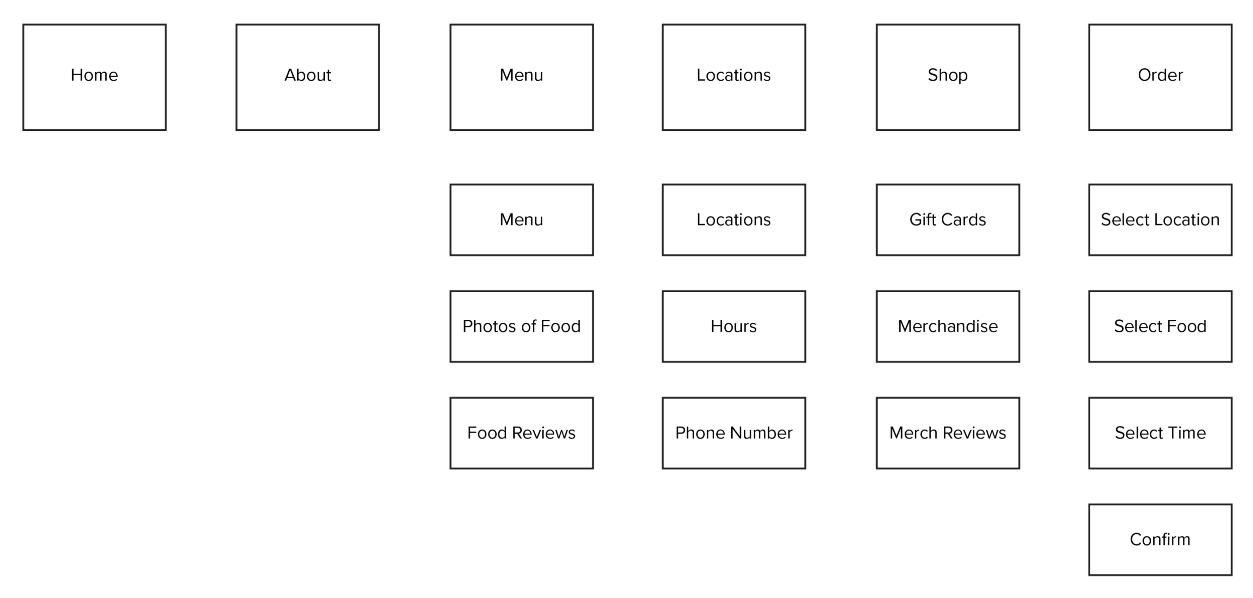
Based on the results of the closed card sorting that I conducted with 4 participants, I decided to simplify the sitemap to only having 1 level of depth.
When I was doing my sketching, I realized I would need separate screens to show more detailed information of each menu items and merchandise items. Another problem that I encountered while sketching is that I don’t have a shopping cart for my gift shop, so I added that as well. For ordering ahead, the button actually works sorta like a shopping cart but exclusively for food. If they haven’t picked any food to order, the order ahead would first ask which location they would like to pick up from. Then it would go to the menu page. If the user already picked some food, then the order ahead button would show what’s already in the cart and has an option for the user to add more item which will bring them back to the menu page.
Low Fidelity Wireframe
Using the new sitemap and navigation schema, I started creating low-fidelity wireframes and prototype for the purpose of usability testing. In order to make sure that my usability tests are consistent, I crafted a user scenario and tasks that needs to be done for the usability test participants.
Scenario: Lauren first heard about this famous biscuit shop in Seattle called Biscuit Bitch. She was told that the Biscuit Bitch in Pioneer Square offers more menu options and ample seating. She plans to go to the Pioneer Square location this Saturday at 12pm. Just like any other famous restaurants in Seattle, she expected some wait times for her visit. When she checks the website to plan her visit, she found that Biscuit Bitch allows her to order ahead for her visit on Saturday to avoid long wait times.
Tasks:
Order ahead an egg & cheese biscuit and cheese garlic grits for your visit to the Pioneer Square this Saturday
Leave a review about the egg and cheese biscuit
Purchase a $25 e-giftcard and a Biscuit bitch trucker hat
Usability Testing: Round 1
I did my first round of usability tests with 5 participants. All 5 test participants were able to complete the tasks presented which are to order ahead and leave a review for an item. However, I discovered a common pain point when my participants are checking out. 3 out of 5 participants were confused about where to click next after they’ve added the biscuit and grits to cart. One of them mentioned that having the number of items on the order ahead button helped inform them to click on that button. However, they are expecting a shopping cart button or icon.
When completing task #2, 4 of my participants intuitively know to go to the menu page to look for the item to submit review. However, only 1 of them clicked on the item to reveal the detailed item page like I expected. The other 3 participants tried clicking on the stars with the expectation that it would give them a popup window that offers them to give review on the spot.
Based on the feedback from the first round of usability testing, I decided to change the following:
When the user had added food items to the cart, the button that says order ahead would changes to say checkout.
Allow user to leave a review by clicking on the stars below each menu item on the menu page
Usability Testing: Round 2
I conducted my second round of usability testing with 3 participants, one of them is the same participant from the first round. This time, I asked them to do all 3 tasks and they all successfully completed the task using the current state of the website. However, I found some things that could be improved based on the qualitative data that I got from this usability tests. 2 out of 3 of the participants thinks that the shopping cart button is not consistent in the order ahead process and the merch checkout process. Initially I added a different shopping cart button for the merch process because I still want to show the order ahead button in the navigation bar. However, seeing my test participants struggle with that, I think it is better to change it to fit their expectations. Another trend that I see with participants is that they all think that there should also be an order summary in the order ahead process, similar to the merch checkout process.
Based on the feedback from the second round of usability testing, I decided to change the following:
Show order summary before select location, date, and time in order ahead process.
Remove the shopping cart link in the gifts page and change the order ahead button to checkout button
Usability Testing: Round 3
I tested the same tasks on 4 more users and decided to get System Usability Scale (SUS) scores. All of the participants successfully completed the tasks. Initially, I was just doing this round to get the scores, but I ended up with some ideas of things that could be improved:
A user asked where her review would show up after she submitted. She was expecting to be directed to the review where she could see that her review is actually posted somewhere.
A few users would like the ability to edit order in the middle of the checkout process, just in case they change their minds.
Some users are still partial to the review popup window. Some don’t mind having it in the right side of the screen while others prefer having a separate window in the center of the screen just so they know to focus on finishing that task before moving on to other tasks.
High Fidelity Mockup
Prior to applying visual design to the redesigned website, I explored the current website to find color and typefaces used for their brand. Overall, the website uses primarily black and white and a couple shades of greys. Furtherore, in every page of their site, they are using a red and white checkered tablecloth as a background of the page. In their menu, I found they are using 2 typefaces which are My World and Calibri. However, in the website, they are using multiple sans serif typefaces other than Calibri.
Being aware that Biscuit Bitch is successful business with regular clients, I decided to keep using their major colors and typefaces throughout the high-fidelity mockup to keep their brand consistent.
In the high fidelity screens below, I decided to keep use 2 typefaces:
My World for the headings
Roboto Condensed for the paragraphs
I primarily use black and white in the design while incorporating some greys as well. To keep the branding consistent, I also used a red and white tablecloth pattern as the page background.
Next Steps
Add a feature to pay with gift card/Paypal/Apple Pay
Add a feature to let user edit order in the middle of the checkout process
After submitting review, direct them to show where their review is posted
Do more testing on the review overlay design (the current overlay design works but 2 out of 8 users said that it looks a little out of place)
What I learned:
This project provided me with my first experience conducting open and closed card sorting activities. From this experience, I learned that user insights are very valuable because I need to understand what I can do to create a delightful experience for them. Ultimately, I learn to be an advocate for users because through learning from user insights and feedback, I was able to create an effective navigation schema and sitemap.
Furthermore, it was very interesting to work with an existing local business because there are more limitations and more things to consider when exploring possible solutions. For instance, I had to keep in mind that there are actual users who are already using the current system. Thus, it would not be a good idea to redesign the website to something completely different because users will have to go through another learning curve to be able to use the new website.


