WSDOT iOS App Redesign
Washington State Department of Transportation, a steward of a multimodal transportation system that prioritizes Washington State traveler’s safety and traveling efficiency.
This conceptual redesign was done as part of my coursework at General Assembly. I took the information architecture and visual design lead role, but all work done encompassed the full range of the User Experience Process.
Role: Information Architect & Visual Designer
When: October 2019
Duration: 12 days
WSDOT iOS Redesign Team
Information Architect & Visual Designer - me
Project Manager - Helen Ling
Researcher - Alyssa Evans
Interaction Designer - Calvin Courter
Research
To begin, our researcher, Alyssa Evans collected data through surveys, interviews, and usability tests to help us define who we are designing for and what features are needed to help them achieve their goals.
Using the data that we collected, we synthesized our research findings and invented our persona, Cindy Washington.
As a team, we also formulated a hypothesis
"We believe that by building a reliable trip planning features for the WSDOT App, we will provide a safe and efficient traveling experience for Washington State travelers.”
To provide a holistic view of the customer experience, I created a user journey map that by uncovers moments of both frustration and delight throughout a series of interactions with the redesigned WSDOT mobile app. Our persona, Cindy's journey map will show how the redesigned WSDOT app can help her achieve her goals.
Feature Prioritization
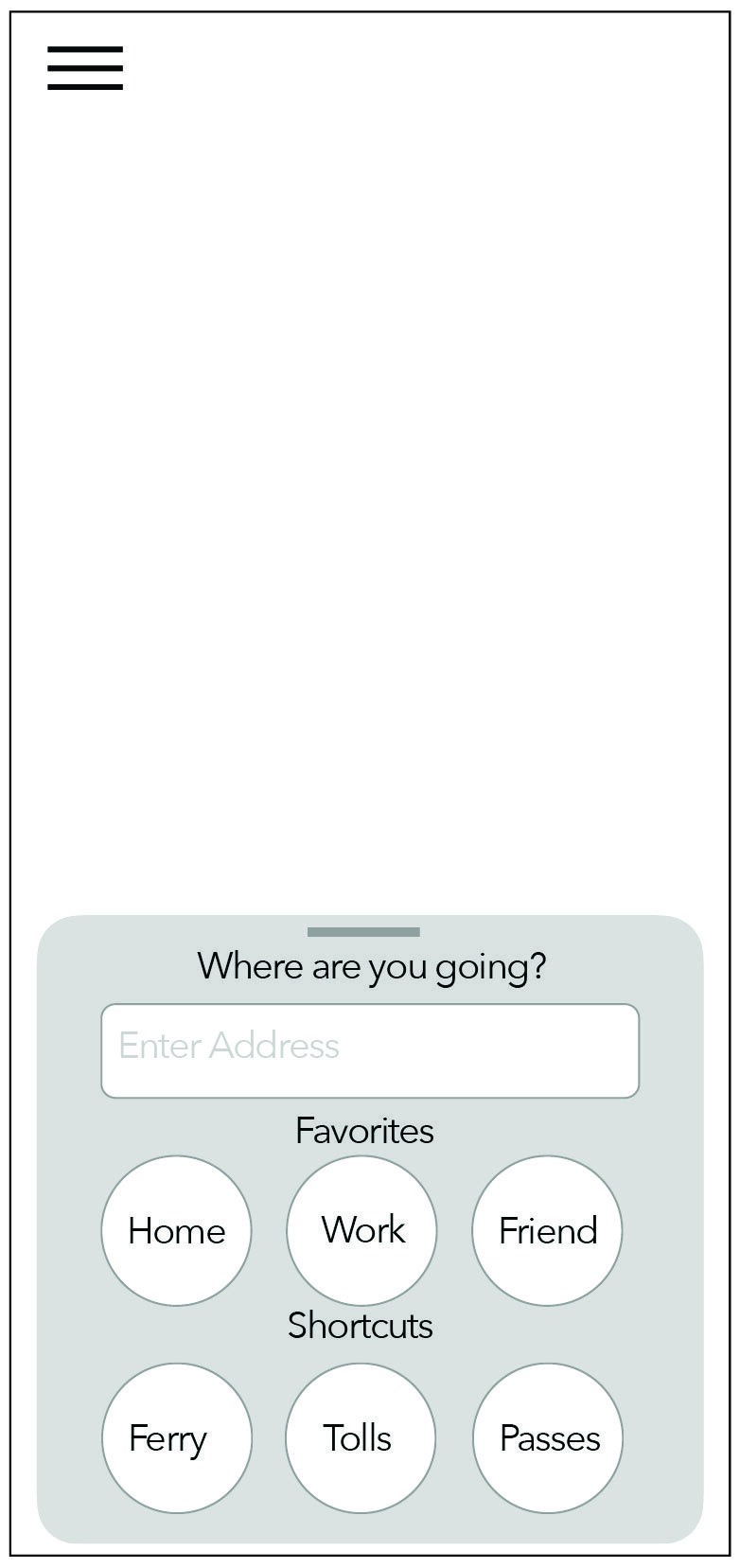
Now that we know that Cindy's main purpose of using the app is to plan her trip, it informs us to prioritize the route planning feature in the app. That means, when Cindy first open the app, the first screen should prompt her to enter or select a destination.
On the original WSDOT app, the first screen that shows when we open the app is the list all their features. Although we want to make sure users know that all these features exist, showing all available features on the first screen would make the app hard to navigate due to lack of information hierarchy.
The image on the left is the list of features that is shown on the first page of the current app. After brainstorming with the Interaction Designer, we came up with a concept idea that allows Cindy to enter an address or select her saved and recent routes with just one tap (see digital sketch on the right).
Comparative Analysis
With that idea in mind, I started looking at other mobile app such as Uber, One Bus Away, Google Maps, and Transit App to do some comparative analysis.
Insights & key takeaways
All competitors shows map as the landing page
3 out of 4 competitors prompt the users to enter their destination on the main page
2 out of 4 competitors have interactive map. It would be nice to show detailed information when an icon in the map is tapped.
Usability Testing Tasks
Through research and brainstorm, we started outlining the interaction goals that is necessary for our minimum viable product (MVP). We established three main goals that users needs to achieve using our MVP:
1. Navigate the map screen and find a way to select a destination
2. Turn on route alerts to get informed about incidents in the selected route
3. Find their way back to the map page and find the hidden navigation bar
Wireframes
After learning from our competitors and fully understanding Cindy’s goals, I collaborated with our interaction designer, Calvin Courter to start brainstorming and sketching.
As he iterated through the design, he uses the feedback from usability testing to find ways to simplify and speed up the process of planning a trip using the WSDOT app.


Insights and key takeaways from Usability Testing
Participants are able to enter their destination without any problem
Some usability test participants are confused when asked to turn on alerts
Participants successfully found the navigation that is hidden in the hamburger menu
High Fidelity Prototype
After iterating through several versions of our design, our interaction designer finalized our wireframes and I started on incorporating visual design to build a high fidelity prototype.
I followed WSDOT’s brand guidelines and Apple iOS Human Interface Guidelines when creating this prototype.
System Usability Scale Scores
To measure the usability and ease of use of the MVP, we collected System Usability Scale (SUS) scores. We gathered SUS scores from the original WSDOT app and also from the redesigned prototype iterations.
It is important to note that the average SUS score for a product to be considered a "usable" is 68%. The original WSDOT app received a SUS score of 44% which is way below the average of 68%. After 3 rounds of iterations, the redesigned prototype scored 95.5%.
Next Steps
Conduct more card sorting activities to define the order of the items in the navigation
Do more research and perform comparative analysis to start designing the push alerts
Build a feature that shows alternative routes to avoid collisions and constructions
What I learned:
I got the opportunity to collaborate with our researcher to define our user persona and create a user journey diagram.
I learned to conduct online card sorting activity and synthesize data from Optimal Workshop to create a navigation schema and sitemap.
This project taught me to start small and iterate. Since WSDOT provides a wide amount or service for Washington State travelers, it was overwhelming for us to redesign the entire app. However, I learned that if I start small, I can make quick changes and add more features over time.
WSDOT iOS Redesign Team
(left to right)
Project Manager - Helen Ling
Information Architect & Visual Designer - me
Researcher - Alyssa Evans
Interaction Designer - Calvin Courter


